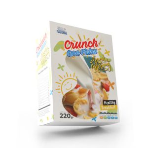
The difference between good packaging and exceptional packaging often lies in color. This guide will show you how the CMYK color chart is crucial for achieving accurate, vibrant print results, and how to apply it to your projects. After reading this guide, you will be able to confidently use CMYK color values to give your packaging the desired look.
Understanding the CMYK Colour Model

You may have heard the term CMYK but wondered what it means for your packaging. CMYK stands for Cyan, Magenta, Yellow and Black. According to professional printers, CMYK is the primary colour model used in the printing industry. Unlike RGB, which is designed for digital screens, the CMYK model mixes ink to create a wide range of colours. Learning to read a CMYK chart helps you understand how these inks combine so you can predict how a design on your screen will look when printed.
The CMYK colour chart is essentially a map of all possible colour combinations created with these four inks. By studying it, designers ensure that printed colours match their intentions and avoid unpleasant surprises. When you work in packaging, this ability to predict colour is vital; it ensures your branding stays consistent across different materials and production runs.
Benefits of Using a CMYK Colour Chart

Working with a CMYK chart offers several practical benefits for you as a designer or product manager:
- Accurate colour matching: When you reference the CMYK chart, you can match your digital colours to printed results, ensuring that your packaging looks exactly as you envisioned.
- Efficient colour management: The chart helps you understand the limitations and capabilities of the printing process, allowing you to adjust colours proactively to achieve the best results.
- Reduced printing errors: By anticipating how colours will translate from screen to print, you can avoid common issues like unexpected colour shifts or muddy hues.
- Improved client communication: Having a physical chart helps you explain colour choices to clients or colleagues, set expectations, and ensure everyone agrees on the final outcome.
These advantages translate into less waste, more satisfied customers and a smoother workflow—especially important when you’re dealing with tight packaging deadlines. At Pakoro, we find that clients appreciate being included in the colour selection process because they can see the exact shades that will be printed.
Navigating the CMYK Colour Spectrum

The CMYK chart covers every hue you might need, but some colours require special attention. Below you’ll find guidance on key colour families and their recommended mixing values. Remember that these ratios are starting points; always test on paper for precise results.
Blues
Blues can be tricky because adding too much cyan or magenta can shift your colour to purple or green. Experts recommend balanced mixtures like 100–50–0–0 (C–M–Y–K) for deep navy hues. When you adjust these values, you’ll see subtle shifts that help you achieve your desired tone.
Reds
Reds often shift towards orange or pink if the magenta and yellow are not balanced. Too much magenta turns red to pink, while too much yellow makes it orange. Start with a near-even mix of magenta and yellow and adjust carefully until you achieve a true red.
Yellows and Greens
Yellow and cyan produce green; equal levels create vibrant greens, but increasing one component can quickly shift to mustard or sage tones. For bright greens, use equal parts cyan and yellow; for darker greens, increase black slightly.
Blacks
Black in CMYK can be printed as standard black (using only the K ink) or rich black (a blend of all four inks). Rich black provides deeper saturation, but don’t set all values to 100 or the paper may oversaturate.
Oranges and Browns
Warm earthy hues like oranges and browns add depth to packaging. A typical orange is 0–50–100–0 (one part magenta to two parts yellow). Unbalanced mixes may produce mossy greens or rusts, so adjust cautiously.
Purples
Purples range from regal, deep tones to bright violets. A common starting ratio is 70–100–0–0 (3:2 magenta to cyan). Too much magenta pushes purple toward pink, while too much cyan leans toward blue.
Pinks
For delicate pinks, keep magenta high and cyan, yellow and black low. You can create everything from soft blush to vibrant fuchsia by adjusting magenta and adding a touch of yellow.
Golds and Silvers
Flat gold and silver tones are possible in CMYK, but true metallic finishes require a Pantone spot ink. Use the CMYK chart to select base colours, then consult with your printer about adding metallic inks when you need a premium feel.
Bright Colours
If you want your packaging to pop, bright CMYK mixes can add energy. While CMYK cannot replicate RGB’s backlit vibrancy, careful mixing produces vivid colours. Use the chart to explore options and avoid neon values that may print dull.
Applying the CMYK Chart in Packaging Design

Knowing the theory is important, but applying it in real projects makes the difference. When you start a packaging project, begin by consulting your CMYK chart to match the colours you have in mind. This step helps you prevent unexpected shifts during printing and allows you to manage client expectations early.
Experimenting with colour combinations is another practical use of the chart. Try creating mood boards with different CMYK values to see how colours interact on paper. This practice not only sparks creativity but also ensures that your packaging stands out on the shelf.
Keep a chart on hand during client meetings. When clients can see the actual swatches, discussions about branding become more concrete and productive. As a packaging professional, this transparency builds trust and showcases your expertise.
Finally, remember to collaborate with your printer. Share your chosen CMYK values and ask for feedback. Printers often provide insights into how certain colours behave on specific materials. At Pakoro, we find that this collaboration leads to smoother production and happier customers.
Conclusion: Elevate Your Packaging with CMYK Expertise
Understanding and using the CMYK colour chart is a skill that sets you apart in the packaging industry. It ensures that your printed products match your creative vision, reduces errors and enhances communication with your team and clients. By mastering colour mixing—whether balancing blues, achieving true reds or experimenting with golds—you’ll create packaging that captivates consumers and strengthens brand identity.
If you’re ready to take your packaging projects to the next level, Pakoro is here to help. Our team has extensive experience transforming CMYK values into stunning printed boxes, bags and labels. Contact us at Melody@pakoro.com or visit our website to discuss your next project. Together we’ll make sure your colours are vibrant, accurate and unforgettable.