Color isn’t just decoration – it’s your silent salesperson.
When you pick up a product because its box makes you feel something, you’re reacting to color psychology in packaging design.
This article shows you how to use colors to attract the right customers, enhance brand identity and drive sales.
You’ll learn the meaning behind key hues, how color influences buying decisions and how you can test and choose the best palette for your paper boxes, gift boxes and food packaging.
If you want more guidance or a custom design, reach out to Pakoro for expert help.
What Is Color Psychology in Packaging?

Color psychology studies how different hues affect mood and behavior.
In packaging design, it’s about using colors intentionally to shape how shoppers feel about your product before they even read the label.
When you plan your box or bag, you have to think beyond aesthetics.
You’re creating a visual handshake that must resonate with your target audience.
Understanding color psychology helps you choose the right palette for paper boxes, gift boxes or food packaging so your brand message is clear and engaging.
As you’ll see, some colors build trust while others stimulate excitement or convey eco‑friendliness.
The Meaning of Different Colors in Packaging

Not all colors speak the same language. Each shade communicates something unique, so it pays to match your product’s identity with the right tone. Here’s a quick guide to common colors and what they signal:
- Blue – Think trust, reliability and calm. Blue is popular for technology, healthcare and finance products because it makes people feel safe.
- Orange – This energetic hue suggests fun and adventure. Use it for impulse buys, sports gear or children’s products when you need to stand out.
- Red – Red grabs attention and creates a sense of urgency. It’s great for limited editions or items with a bold personality.
- Green – Green communicates nature, health and sustainability. Ideal for organic foods, eco‑friendly products and wellness brands.
- Black – Black represents luxury, power and elegance. Use it for premium gift boxes, high‑end gadgets or cosmetics.
- White – Pure and simple, white projects honesty and cleanliness. Perfect for minimalist design or products emphasizing health and purity.
- Yellow – Warm and optimistic, yellow appeals to young audiences and lifestyle brands. It’s also useful to highlight special features or limited offers.
When choosing colors, keep your audience in mind.
For instance, younger buyers often prefer vibrant combinations, while older consumers lean toward neutral tones.
Different cultures also assign distinct meanings to colors, so research your markets carefully.
How Colors Influence Consumer Behavior
Color choices go straight to the human brain. Studies show that a majority of first impressions are based on color alone.
That means your packaging design has to work instantly.
Here’s how colors drive behavior:
- First impressions and shelf impact – On crowded shelves, an eye‑catching hue helps your product stand out. Red, orange and bright yellow create urgency and can encourage impulse purchases. Muted tones like pastel greens and blues are calming and suit products where trust matters.
- Perceived value and pricing – Darker shades like black and deep purple often signal luxury, allowing you to position your product at a premium. Conversely, earth tones and light greens suggest affordability and sustainability.
- Emotional connection – Colors trigger emotions that align with your brand. Green evokes calmness and health, while vibrant red spurs energy. When consumers feel aligned with a mood, they’re more likely to buy.
- Cultural and demographic influences – Gender, age and cultural background shape color preferences. For example, some cultures associate white with purity, while others link it to mourning. Always research your audience to avoid miscommunication.
By understanding these factors, you can design packaging that not only looks good but also supports your sales goals.
Using the Color Wheel and Combinations

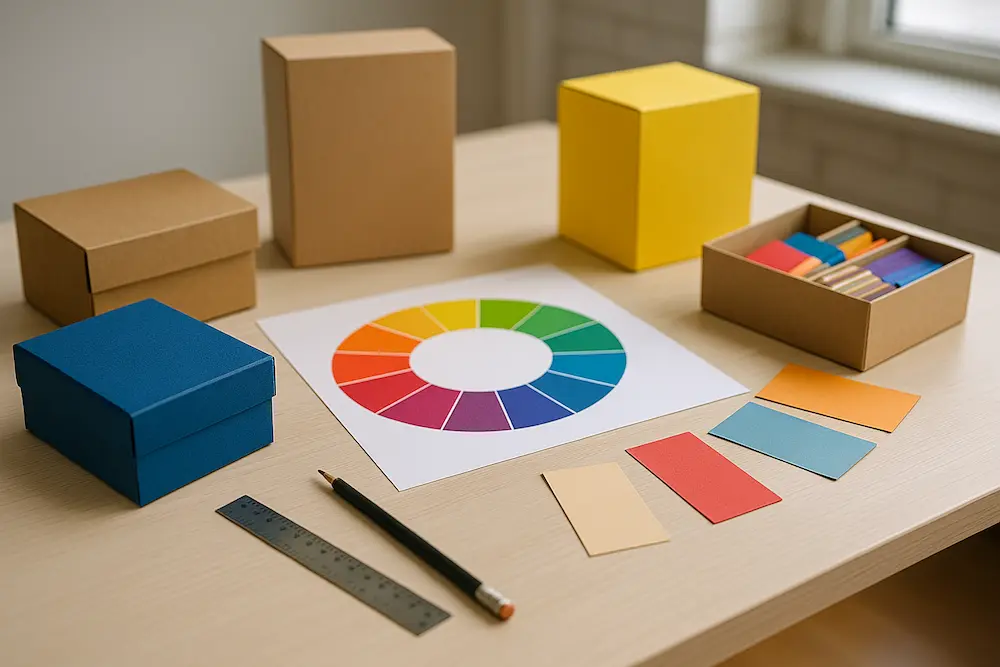
The color wheel is a powerful tool for creating harmonious packaging designs.
It helps you balance contrasting and complementary tones so your product catches the eye without overwhelming it. Here are a few tips:
- Complementary colors – These are opposite each other on the wheel, such as blue and orange or red and green. They create strong contrast and make your packaging pop.
- Analogous colors – These sit next to one another, like blue, teal and green. They produce a calming, cohesive look that’s perfect for health or eco‑friendly brands.
- Triadic schemes – Using three evenly spaced colors (like red, yellow and blue) provides vibrant balance. This strategy works well for playful or youthful products.
- Monochromatic palettes – Choose shades of a single color to achieve a sophisticated, minimalist design. This is excellent for luxury goods and high‑tech items.
Remember to test your color combinations on different materials. Colors can shift slightly on coated paper versus recycled cardboard, so sample prints are essential.
Case Studies of Successful Color Use

Color can define a brand. Consider how a turquoise box with a white ribbon feels instantly luxurious and refined, suggesting a premium gift.
Meanwhile, a red can evokes excitement and energy – perfect for beverages or snacks aimed at a dynamic audience.
These examples show that you can own a specific hue and turn it into an asset.
When you select a color palette that aligns with your brand values, you build recognition and loyalty.
How to Choose and Test Your Packaging Colors

Selecting the right colors is part art, part science. Follow these steps to ensure your choices resonate:
- Define your brand personality and audience – Decide what emotions you want to evoke. Are you fun and casual, or refined and exclusive? Then research your target demographic’s preferences and cultural contexts.
- Study competitors – Look at how similar brands use color. Identify gaps or opportunities to differentiate your paper boxes, gift boxes or food packaging.
- Create prototypes and test – Use digital mockups and printed samples to evaluate how colors look in real life. A/B testing with small focus groups will show which palette appeals most.
- Collect feedback and refine – Analyze sales data and customer surveys after product launch. If certain colors underperform, adjust accordingly.
By iterating and refining, you’ll find a color scheme that not only looks beautiful but also drives conversions.
Conclusion
Color psychology in packaging design isn’t guesswork – it’s a strategic approach to connecting with your customers.
By understanding the meaning of colors, how they influence behavior and how to test combinations, you can create packaging that stands out, tells your story and delights shoppers.
If you’re ready to transform your packaging with expert guidance, Pakoro is here to help.
We specialize in paper boxes, gift boxes and food packaging and can work with you to select colors that align with your brand and market.
Contact us at info@pakoro.com or call +886‑2‑1234‑5678 to start your journey toward eye‑catching, effective packaging design.