Have you ever received a package from your favorite store? Seeing the brand logo on the box can immediately ignite a feeling of excitement and anticipation.
It tells you where the package came from, builds on the positive associations you already have with the brand, and creates a special connection between you and the product inside.
If you don’t pay much attention to your packaging and logo design, it’s time for a change.
A plain, generic box with little to no branding can leave customers feeling indifferent or even uncertain about what they are receiving.
On the other hand, a thoughtfully designed logo on your packaging has the power to:
- Enhance brand recognition and improve brand awareness.
- Accurately represent who you are, ensuring brand consistency.
- Set customer expectations, strengthening consumer trust.
Logo and packaging design is a powerful concept, and here, we want to help you harness that power to elevate your brand.
Below, you’ll find comprehensive tips on how to design the right packaging logo.
We’ll also include examples from some of the top brands that have mastered the art of packaging. Let’s get started!
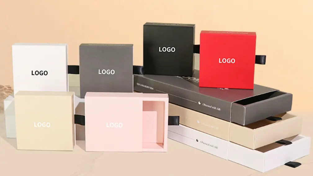
Things to Consider in Logo Design for Packaging
Before we get into specific tips for creating an effective packaging logo, there are several important considerations that you should keep in mind:
1. Brand Consistency
Your packaging logo should always align with your brand’s identity, including your values, personality, and target audience.
Your logo is one of the most recognizable elements of your brand, and it’s essential that the message it conveys is consistent with everything else you do.
A consistent brand presence is more engaging and builds greater trust with consumers, helping you stand out in a competitive market.
2. Interaction of Design Elements
Designing a logo isn’t just about picking a color or font you like—it’s about how the different elements interact with one another.
You need to think carefully about how the logo’s colors, typography, spatial arrangements, and other design components work together.
A well-designed logo has harmony among all these elements, resulting in a pleasing and impactful appearance on the packaging.
3. Packaging Options
There are many types of packaging available—different materials, sizes, shapes, and textures.
Your packaging could be anything from large cardboard boxes to small pouches or tote bags.
A good packaging logo should work seamlessly with all of these elements, adapting to different types and styles of packaging.
Think about how the colors, size, and materials of the packaging may affect how the logo appears to customers.
Choosing the Right Colors for Your Packaging Logo
Colors are incredibly powerful, and they play a significant role in determining how people perceive your brand.
The colors you choose for your packaging logo can evoke specific emotions and influence consumer behavior.
For instance, red is known to create a sense of urgency or excitement, while blue conveys feelings of calm and reliability.
Choosing the right color palette requires a deep understanding of your brand, personality, and goals.
Do you want to convey energy and passion? Then you might choose red or orange.
Do you want to project sophistication? Black and gold might be your go-to colors.
Additionally, be mindful of how the colors of your packaging materials may impact your logo’s colors.
For example, textures and printing techniques can alter how colors appear in real life, so make sure to anticipate these variations and adjust your logo as necessary.
A prime example of effective color use is the iconic Tiffany Blue Box®.
The signature blue conveys luxury and quality, and it immediately tells consumers that there’s something special inside.

Typography Tips for Logo Design for Packaging
Typography—the style of the text—is an often-overlooked but extremely important element of logo design. Fonts can convey personality and evoke strong associations in the minds of consumers.
Consider Comic Sans, a font that has become synonymous with playfulness and even informality.
Typography can either elevate your brand or work against it.
When choosing typography for your logo, consider the following:
- Readability: Visual impact is important, but if customers can’t read your logo, they’ll quickly lose interest. Make sure your typography is legible.
- Variety: You can use multiple fonts, but keep it to a maximum of three. One can be used for aesthetics (e.g., the company name), while another can be more functional (e.g., for descriptions or taglines).
- Placement, Spacing, and Size: Consider where the text will appear on the packaging, how large it will be, and whether it will still be effective at different scales.
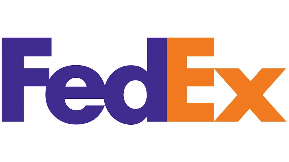
FedEx is a great example of smart typography use in logo design.
The hidden arrow between the letters “E” and “x” conveys speed and excitement—a perfect fit for a logistics company.
Plus, the combination of colors and the use of negative space makes the logo highly recognizable.
Incorporating Imagery in a Packaging Logo
The strongest logos are often recognizable even without words. Imagery can make your logo stand out and speak volumes about your brand.
The key is to keep imagery simple and memorable, rather than overly detailed and complex.
This minimalist approach ensures that the logo remains easily recognizable across different packaging types and sizes.
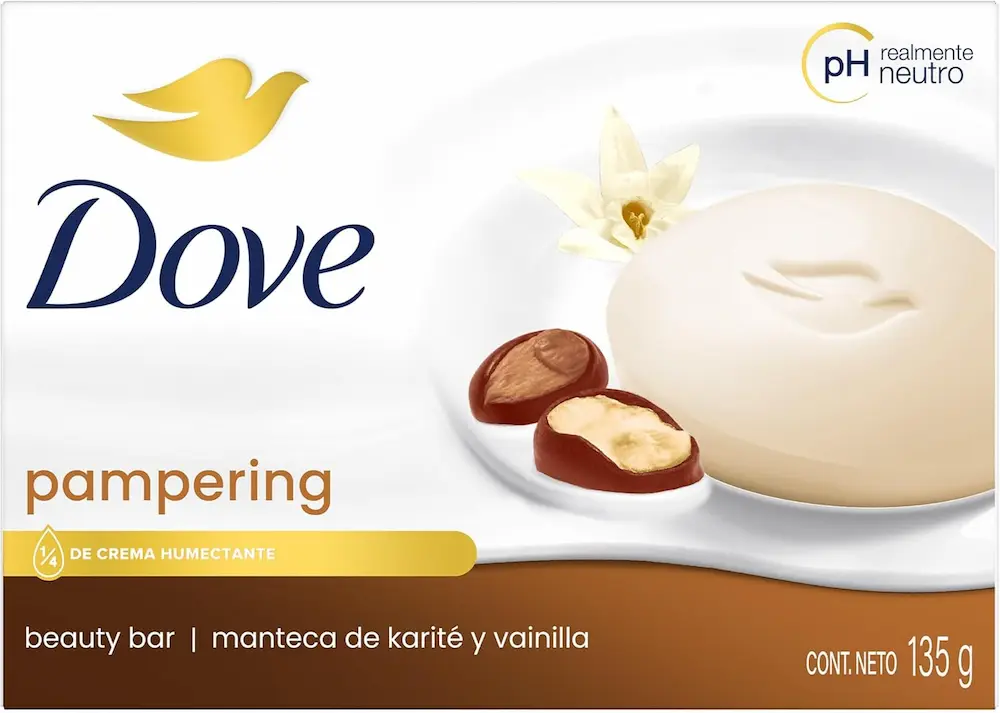
Dove is a perfect example of incorporating imagery.
The elegant dove icon speaks to the brand’s qualities—natural, soft, and caring—and the golden color adds a luxurious touch.
Even without the brand name, the dove symbol is enough for consumers to recognize the brand instantly.
Ensuring Scalability and Versatility
Your logo should be versatile enough to work on all sizes of packaging—from large shipping boxes to small product samples.
A scalable logo will maintain its clarity and quality regardless of its size.
This requires you to use clear, distinctive elements that are easily distinguishable at any scale.
To make sure your logo is versatile, consider its positioning, orientation, and spatial arrangements.
Will it fit well on different types of packaging?
Will it still be effective if it needs to be smaller or larger?
If needed, create different versions of the logo to adapt to specific types of packaging, though this can sometimes be costly.
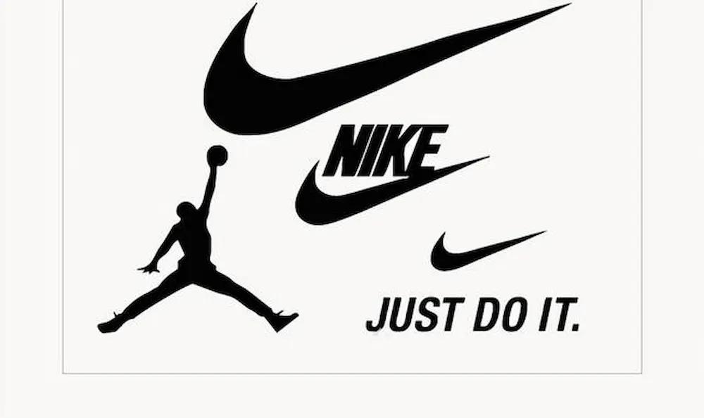
Nike does an excellent job of ensuring scalability and versatility.
The iconic Swoosh logo is instantly recognizable, whether it’s used on a shoe, a large billboard, or a small apparel tag.
Nike adapts the Swoosh to different lines and products without losing its essence.
Balancing Simplicity and Complexity
A successful packaging logo strikes the right balance between simplicity and complexity.
A logo that is too simple may not be memorable, while one that is overly complex can be hard to reproduce and may confuse customers.
The best approach is to focus on a couple of strong elements—perhaps an icon and text—and create a clean, recognizable design.
Use clean lines and readable typography to deliver your message concisely without sacrificing brand identity.
The Amazon logo is a great example of striking this balance.
The smile/arrow is simple yet memorable, and its placement creates a sense of satisfaction and reliability.

Testing and Iterating Your Packaging Logo
The design process doesn’t end once you create your first draft.
To ensure your logo and packaging design are successful, you need to test and iterate.
Create prototypes and gather feedback from your target audience to refine the design until it meets your objectives.
Experiment with different colors, fonts, imagery, and placements.
Testing the design on various packaging formats will help you identify any adjustments that need to be made to improve the final product.
Don’t forget that trends and brand identity may evolve over time, so be prepared to revisit and adjust your design as needed.
Conclusion
Packaging and logo design is an essential part of your brand’s overall strategy.
It contributes to brand awareness, builds consumer trust, and creates a positive customer experience.
By carefully considering design elements like colors, typography, imagery, and scalability, you can create a logo that elevates your brand.
Take this opportunity to review your current packaging design and look for ways to make improvements.
Use premium logo templates and creative assets to craft the perfect packaging logo, and then partner with a trusted manufacturer to bring your vision to life.